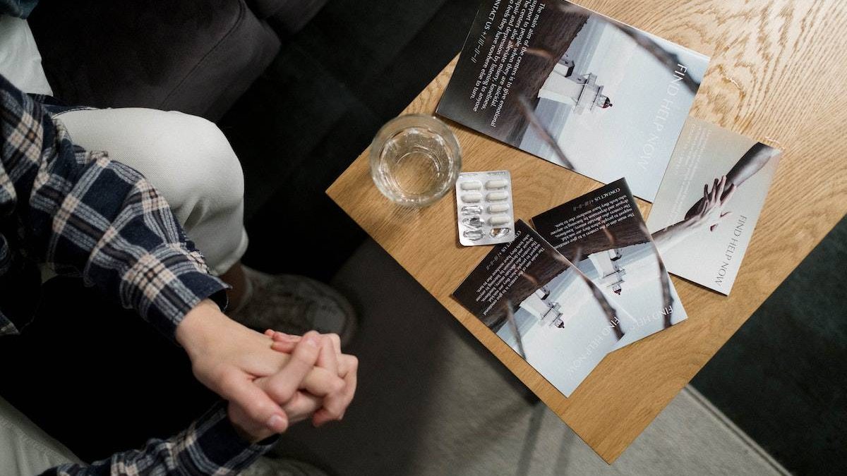
Brochures are simple two-, three- or Z-fold documents used to promote businesses or events. Nowadays, many companies are seen rolling out brochures to ensure that their products and services reach the masses. Moreover, a well-designed brochure is there to help you win half the battle when it comes to your powerful marketing efforts.
It’s an efficient marketing and sales tool that can help you remind a potential customer of your fantastic offer. The brochure can contain information about your company, in-depth knowledge of your products, or a description of your services. How much and what information the brochure should contain depends on how the brochure is to be distributed or made available. Essentially, a good brochure captures the readers’ interest and spurs them into action.
If you don’t exactly know how to begin crafting a brochure that signals competence, below we share the main steps for creating one that will not only wow your readers but also helps you achieve your business goals.
Table of Contents
Create an Outline
Brochures usually vary in their content and length but most of them follow a standard format. In general, their front panel displays the business logo and headline, the inner panels present the product or service by sharing facts and details, and the final panel contains important contact info and a call to action.
If you don’t know what this looks like, before getting started, you can take a look at excellent brochure templates and see how to use them to create your own eye-catching and informative brochure.
Remember to first identify your target persona including age, gender, location, interests, and challenges. When targeting your audience, try to answer questions such as whether they’re specialized or familiar with your subject, how they’ll use your brochure, will the brochure be used with other marketing tools, etc.
This information will steer your design decisions and set your brochure’s tone, language, and content, and help you choose a call to action that attracts your readers.
Write an Appealing Headline
The headline you use will determine whether a prospect grabs your brochure and reads it, or decides to toss it aside. For this reason, try to avoid headlines that don’t share anything about the actual content of the brochure.
Instead, try to provoke their curiosity by being straightforward and not vague. Everyone wants a headline that will spark interest so make sure to do your homework to see which headlines would be effective. We encourage you to use “power” words like discover, easy, free, fast, proven, or compelling that will trigger a positive response from your target audience.
Be Precise and Clear
A rule of thumb is to ensure that your brochure focuses on a single product or service. For instance, a tri-fold brochure has space for around 340-450 words so it’s essential to keep your words, sentences, and paragraphs short. Editing is key so do this properly, including the most relevant information, and leave enough room for white space and images. Avoid putting more than a couple of paragraphs in a row without introducing something different to break up the monotony, like a subheader, bullet-point list, or image.
You can use online drag-and-drop editors to help you design your brochure and include elements such as pull quotes or tables.
Limit Your Copy to 1-2 Typefaces

When choosing your typefaces, make sure they are easy to read and consistent with your branding. Limiting your copy to 1 or 2 typefaces will make the design process a little more streamlined, it takes some of the pressure off and helps you create a more cohesive look for your brochure.
Always choose your font size, spacing, and color with readability and harmonious effect so your prospects don’t have to struggle when reading your brochure.
Include Call-to-Action
Your brochure’s main goal is obviously to convince your readers to take a specific action. This call-to-action is usually placed on the final panel of the brochure where the contact info is provided. To increase response rates, try to offer an incentive like a free sample or promo code.
Some example actions you would perhaps want your readers to take include signing up to your email list for a free white paper, calling to book a free consultation, visiting your store for an upcoming sale, or visiting your website to sign up for a program.
Proofread

Errors and inconsistencies are a reality so before going to print, proofread your brochure and verify that the tone matches the rest of your brand messaging. Be especially careful with spelling, punctuation, and grammar mistakes as this will save you time, and money, and make your brand look good in front of others.
Conclusion
Seeing your brochure come to life is exciting so this is why you should apply the necessary amount of effort from the very beginning. When finished, you’ll be surprised at how a brochure can serve as a versatile marketing tool and attract prospects.
Related posts
Sidebar
Recent Posts
An Inside Look Of Paraulogic
Introduction Welcome to the exciting world of Paraulogic! Are you ready to dive into a linguistic adventure and put your…
Empowering Artists with Cryptocurrency: A Guide to Selling Art Using NFTs
In the ever-evolving landscape of the art world, artists are constantly seeking innovative ways to showcase and monetize their creations….


